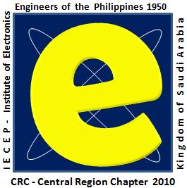
Officers of the IECEP Central Region have chosen already the winner for the logo competition. Congratulation Engr. Mar Balboa!
From the three logo competing entries by individual, the logo that has been chosen was a little bit different than that of a traditional logo. The entry by no less than the President-elect Engr. Balboa has been selected last Tuesday (March 16, 2010) during the officers meeting and is now officially the logo of IECEP-KSA-CRC.
 The idea behind this logo was initially brought by Engr. Moody who suggested having a letter E that stands for Electronics. Thinking to have a simple logo yet a stylish one or modern looking, Engr. Mar Balboa and Engr. Moody came out with this letter E symbol surrounded by two paths of electrons revolving around letter E.
It differs from a traditional logo in the sense that its shape is a square than a circle commonly being used in most of the logos. However, it resembles similarities to logos use in Information Technology employing a letter E.
A product of discussion between officers of the organization in a coffee break to conceptualized a simple logo and one that is easy to print, it turns out that this logo was the choice of the group since it is in-line with the modern concept.
The color of letter E can be easily change to different colors when it is needed to create an animation effects in addition to embossed or three dimensional effects (3D-effect) of the letter E. The caption Institute of Electronics Engineers of the Philippines 1950 and IECEP-KSA-CRC 2010 can be seen at the outer perimeter of the frame. Over all, this logo is unique but inherits the properties of IECEP logo.
After several meetings, it was decided that the final version of this logo must display the full ECE instead of single E. Hence, the logo was now fine tuned as the logo below.
 IECEP MIDCON 2023: 73rd National Midyear Convention (Industry Tour)
  Life Membership Application for IECEP-KSA-CRC
  Registration – Fiber Opics Cabling Cluster Course